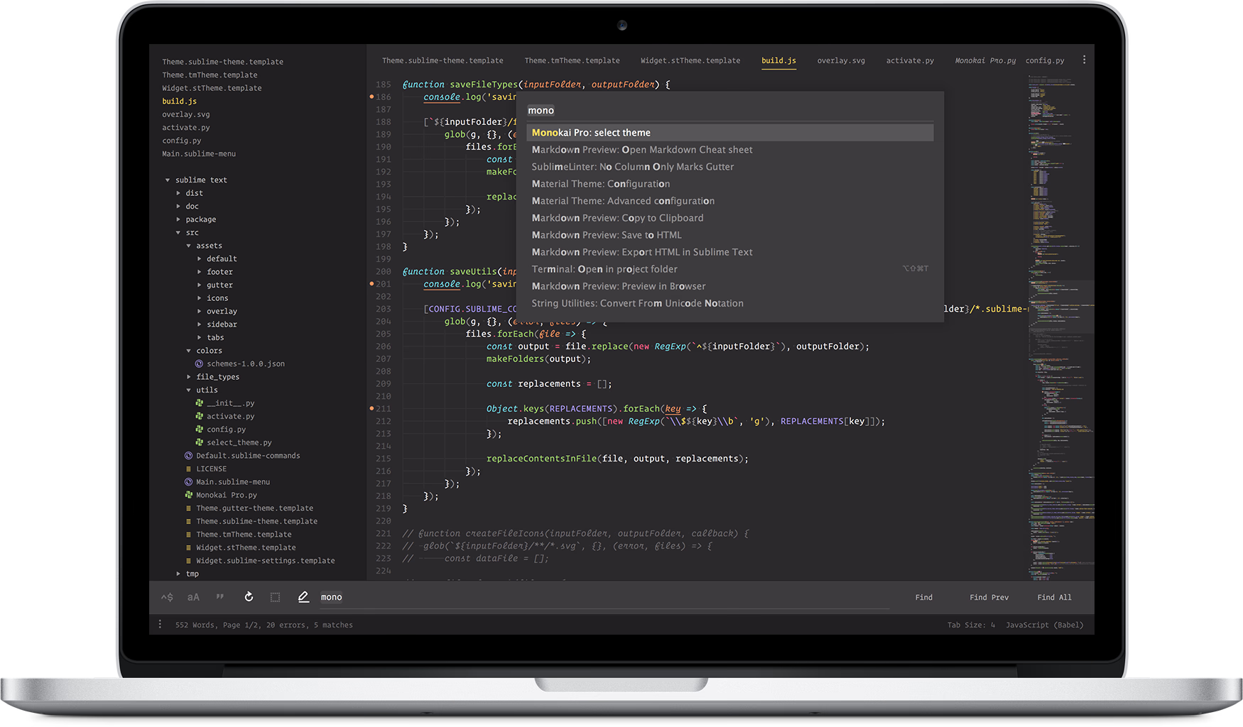
Monokai Pro: beautiful functionality for professional developers
Creating the ideal coding environment in Sublime Text
June 22, 2017 2 min. Web DevelopmentDesignProgrammingSublime Text
Back in 2006, I created the Monokai colors. Today I’m releasing Monokai Pro, a new color scheme and user interface theme for Sublime Text.
Install it like this:
Step 1. Package Control ‣ Install Package ‣ Theme — Monokai Pro
Step 2. Quick panel ‣ Monokai Pro: select theme
Beautiful Functionality
Almost every code editor has a Monokai preset. It has been recycled, remixed and implemented in more software products than I can count. The old Monokai has been going strong for more than a decade.
The new Monokai Pro not only is an updated color palette, it’s a complete visual overhaul of Sublime Text. A color scheme for syntax highlighting in multiple languages and a user interface theme that doesn’t get in your way. It contains more than 50 custom made icons.
The single goal of Monokai Pro is to help you focus. All design decisions were guided by the principle of Beautiful Functionality. Carefully selected shades of colors are the foundation of an uncompromising, non-distractive user interface.
The single goal of Monokai Pro is to help you focus.
Color harmony
What makes Monokai Monokai are its vibrant accent colors. It’s key for good design that colors are balanced. This isn’t a very straightforward mathematical process. To achieve color harmony, you need to carefully handpick the best matching colors.

If you look back at the old Monokai preset, you notice some accent colors “pop” more than others. The pink stands out because it’s vibrant, but the perceived lightness of that pink is actually less than the other colors. This difference, perhaps unconsciously, feels somewhat unbalanced. Monokai Pro solves this by better harmonizing its colors.
The icons in Monokai Pro look as sharp as Dracula’s fangs
Filetype icons help you to quickly scan through your code base. However, creating icons is not the same as slapping down a scaled down logo next to the filename. That leads to blurry icons, because the shapes don’t line up perfectly with a pixel grid.

Blurred icons not only look frustratingly bad, they lead to unrecognizable graphics. They also make you squint and make you think you need glasses. The icons in Monokai Pro are made from scratch. Point-for-point perfect pixel pleasure. That’s 5 P’s.
Color filters
Monokai Pro comes with a set of five color filters that suit your mood. They’re all variations on the standard palette, and they’re all Monokai Pro. You can quickly switch between the filters, the sidebar icon colors will match as well.
Monokai Pro has a couple of other design tricks up its sleave, like automatic sidebar font syncing, monochrome icons and a “minimal” setting. That’s for the pros, and you can read up on that on the site: https://monokai.pro.